A homepage should catch a few seconds of attention given to it, that is why it is important to have the layout convey the message well. Above the fold placement has been practiced by traditional print media for many years now, it is the upper half of a newspaper fold. In web design, above the fold simply means somehow the same and it is a common practice to place your most important content on the upper 600 pixels of the design.
On this post I am featuring some effective homepage designs I have stumbled on the net recently not because of their usage of the above the fold principle but also because of many factors.
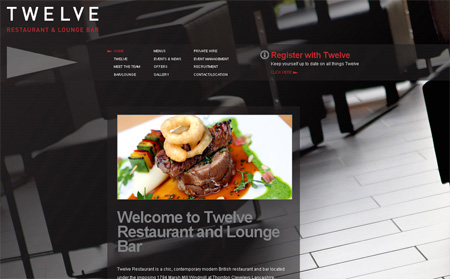
Twelve is a restaurant and lounge bar. I find this site effective mainly because you know right away what the site is about. The homepage may not contain a few bits of information about this restaurant but it has a well laid-out main navigation near the top.

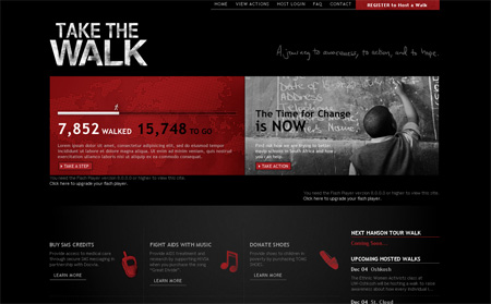
Take the Walk is an organization that helps fight Aids and poverty in Africa. This site has more content to show than Twelve and it was presented very well. To the right of the site logo is a tagline that defines in a few words what the site is about, which is an organization that helps the needy. At the top of the page it has the main navigation and with it is a red button that says “Register to Host a Walk”, which is your call-to-action. Right below the logo is an animation that discusses further the cause of the site and another button to call-for-action. The website is effective due to its strategic positioning of call-to-action buttons, the one above for those who have visited the site before and is just returning to do the action and just near the presentation of the cause is another button for new visitors who has just finished viewing the animation who may want to do the action right away.

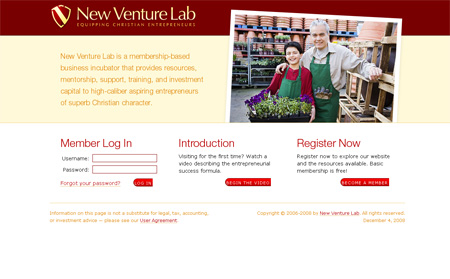
New Venture Lab simple presentation of content made this site effective. There is a brief introduction on what the site is about and 3 options on what to do next; to log-in, to watch an in-depth video and to register to be a member. Simple and effective.

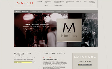
Match has the same principle as New Venture Lab in terms of layout which is why this site is also effective but since this site has more content to offer the main navigation on top just beside the logo. I love the way the main menu and submenu are laid all out so the user can have more control on where they might exactly want to go.
